The dangers of an unmaintained website
October 9, 2019
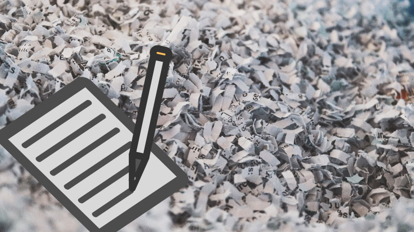
Free stock images – Where we go for free stock photos
October 5, 2020
Website design has been in a state of constant change since the internet began in the 1980s. Back then it was simple text documents linking to other simple text documents. Later, small 8-bit graphics gave way to tiny grainy images, then text of all shapes and sizes, large images, video, and animations culminated in sophisticated designs, all to communicate a message to its visitors.
What are the elements of good design in a website today? And what should you look out for in a well-executed design for your website?
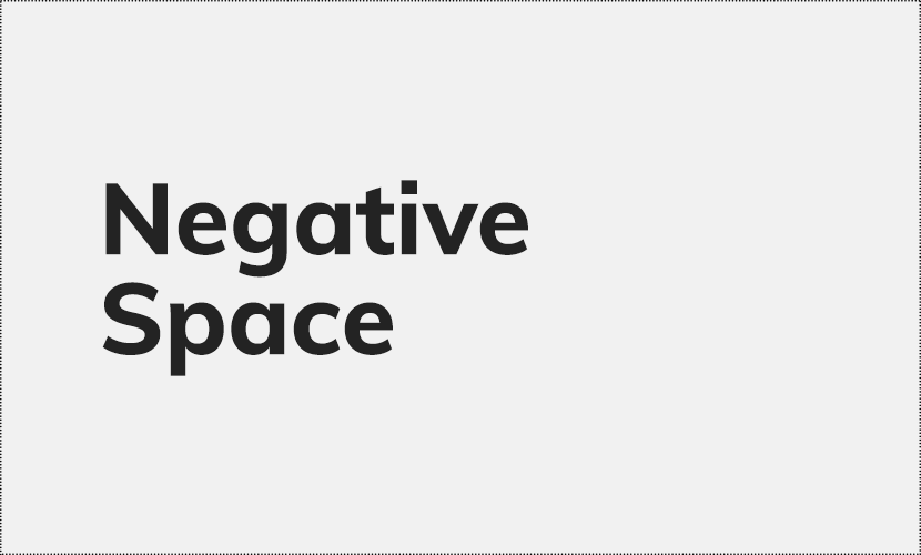
Negative Space
If you’re keen about a new website for your business, you may be hoping all your content will be front-and-centre; with your words and images claiming every available space. But will cramming in the content make your site successful?
Websites that pack in the content are difficult to read. Without a place for the eye to rest or room to breathe for your messaging, people will scan over your words and pictures too rapidly, without taking anything in.
Think of how you cast your eyes over a junk mail catalogue received in the mail – each page packed with products. What speed do your eyes travel? Do you read each word, pause at each picture, can you name 5 products from the page after you put the catalogue down? Or have you run over it quickly, only pausing on prominent text or a bright colour accent?
Negative space (ie: nothing space) is the blank space around an object in art and design. It doesn’t have to be white space, it could be of any colour, it only matters that there are no features to the space.
What’s its job?
- It helps to slow the speed of reading.
- It makes the site visitor pause on a word or an image.
- It helps to show what’s most important and what’s less important in the design.
If the site is so jam-packed with content with no place to rest, it won’t matter how well-crafted the words and carefully chosen the pictures are – your visitors won’t be able to read your site successfully or take the actions you want. Mix in a little negative space here and there and you’ll get a site that flows well and is effective.
Hierarchy
Negative space also plays a part in the visual hierarchy of a design. As I said, showing all information with equal prominence makes the content hard to read.
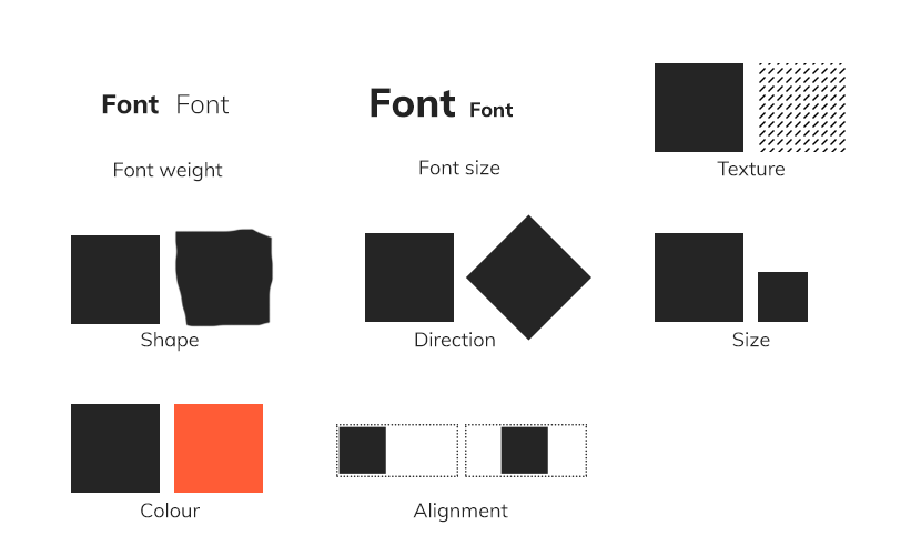
In design terms, hierarchy is how we show the order of importance of information on a site using visual cues. We’d use visual elements like font size and weight, colour, contrast, white space, texture, alignment, etc to draw attention toward or away from certain elements. For example, when an important heading is in large, bold, bright text, it’s grabbing attention and saying “Look at me! Look at me!” But less important text may be in a small font size in dark grey or black.
The way we choose to set up this hierarchy will depend on what the most important messages of your website are. Then we want to direct your visitors to take action! Make contact! Buy something! Book now!
Logo – How big should your logo be and why?
Space in a website navigation is at a premium. Everything must be working hard for your business, showing clearly the most important and most frequently used links, to be super-efficient for your site visitor. Navigation bars are at their best when they are small. They’re full of important links to help people get around, but shouldn’t detract from the main content of the site.
Enter your logo. A logo is an important ingredient and says: “This is my website and nobody else’s!” Logos must be well balanced with the usability of the navigation, the other features, and content in the site. This usually means they should be kept relatively small. You don’t want your logo so large that your navigation pushes your content down too far on the screen. You also don’t want the logo so large that it competes with the other messaging on your site. It has an important place as branding, but your visitor is more interested in what you can do for them!
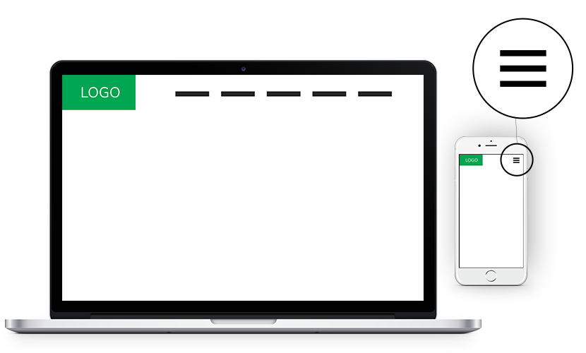
Hamburger menu
A hamburger menu is a small icon you might have noticed when visiting websites from your mobile phone. It comprises of three short parallel horizontal lines (a bit like a simplified hamburger shape). When you tap it, it opens a dropdown of menu options for your site.
This symbol has come to be shorthand for a website’s main navigation menu and allows it to be simplified on small screens. For example, if a website had 6 top links in its menu, imagine how cramped the top of the page would be on mobile. The navigation of the website would be filling up half of the viewing area of the phone’s screen. Pushing what you want to actually say to a visitor way down. A big no-no.
Websites must be designed to consider all the devices they might be viewed on
- Mobile phones (viewed both vertically and horizontally)
- Tablets (viewed both vertically and horizontally)
- Laptops
- Desktops
This is called responsive design. Hamburger menus are most often seen on websites viewed on mobile phones. When the site is viewed on a desktop or laptop computer, the navigation reverts to the long-form menu. Having said that, hamburger menus are being used more and more on desktop or laptop displays too, to achieve a cool minimal look.
Font choice – serif vs san serif
Many people have certain fonts they just inexplicably can’t stand. Is there a font you hate? Does it come to mind straight away?
Often, it’s from overuse or maybe it was a default font you were forced to use. That is my story with Comic Sans and Times New Roman. **Shudder** But thankfully those times are far behind us and fonts are available in all shapes and sizes for web.
What are Serif and San Serif fonts?
Have you heard of these terms? They denote the presence or absence of serifs. A serif is the decorative taper or line added to the beginning and end of a letter. Eg:
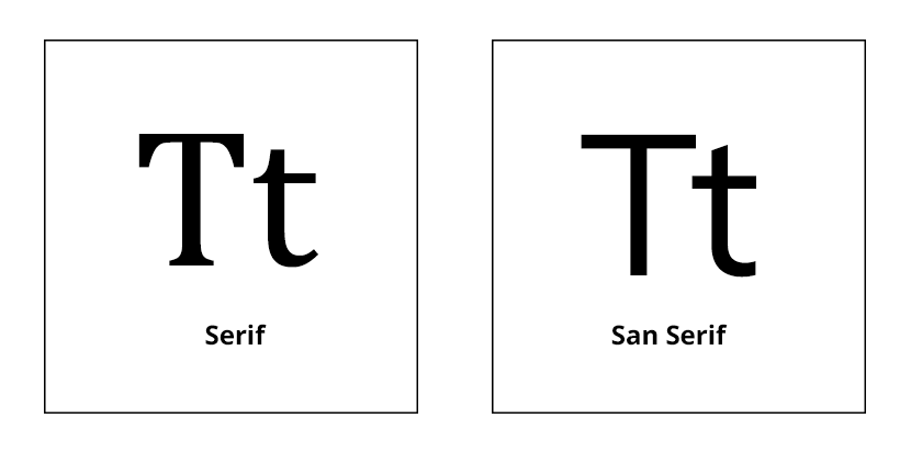
Serif fonts are widely used in books, newspapers, and magazines. They convey a sense of sophistication and trustworthiness.
What does a serif font say about your brand?
- Elegance
- Confidence
- Tradition
- Reliability
San serif fonts are considered modern because of their minimalist look and a bit playful because of their simplicity.
What does a san serif font say about your brand?
- Casual
- Informal
- Friendly
- Very approachable
It’s not that one is dated and the other is new and current; they both have their uses today. They can each be used to convey different things about your brand, they can even be used in combination, eg: a serif heading and a san serif body font, or vice versa. We might recommend one or the other or a combination of the two. Now that you’re in the know, you will notice these two font types used all over the place.
All these elements can be used in creative ways to craft a website designed to grab the attention of your visitors. Important visual cues like negative space, logo size, font colours, styles and sizes make up a visual hierarchy that helps your message to be clearly visible and easily retained.

2 Comments
Naomi thank you for sharing few tips about website design from Logo to Fonts. Great informative article. Keep post!
Very interesting and helpful. Good job! Thank you!